Project 08 / 08 · FinTech Concept
Neuv · Brand & UX System
Client
Self-Directed Concept
Role
Concept Designer, Brand & UX
Sector
FinTech
Year
2025
Role
Concept designer, brand and UX. Self-directed.
Team
Solo. No external review.
Timeframe
2025.
Methods
Brand identity, type system, interface system, screen mapping. Built in Figma and Illustrator.
Outcome
A complete fintech identity and interface concept, built for my portfolio and to explore plain-language finance.
The problem
A wave of digital banks and fintech companies was starting up. I wanted to explore the idea underneath them: clarity in finance starts with clarity in design.
Financial products are dense. They handle risk, forecasts and security, and they often explain all three badly. This is a personal concept, not a client job. There was no brief, no user base and no launch.
My role
Everything. I built the brand from naming logic to the custom mark. I chose and paired the type. I designed the layout logic, icon language, colour system and UI hierarchy, and mapped every screen from onboarding to dashboard as one modular system.


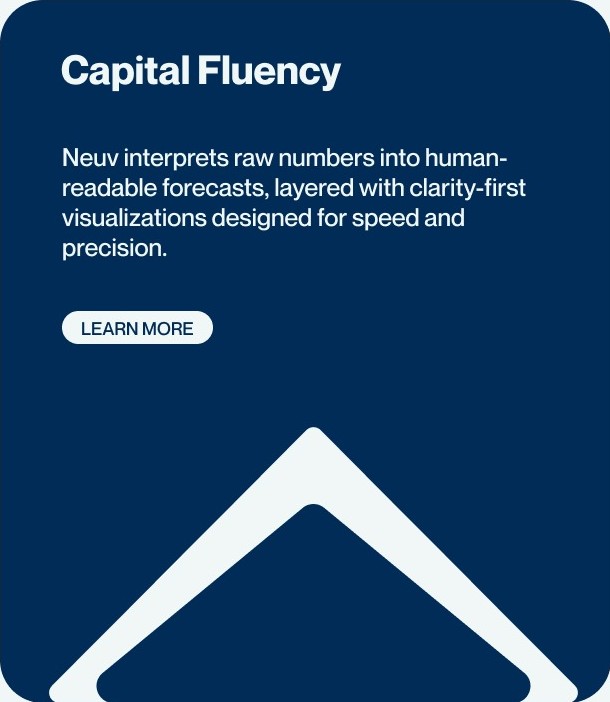
Brand positioning, security messaging and capital-fluency framing, three faces of one system
Design Language
A bold logotype paired with quiet, editorial system type: structured, analytical, visual-first.
Type
Display
A bold logotype face. Monument Extended.
Type
Interface
A neutral system face. Neue Montreal.
Layout
Modular grid
Shared rules, not one-off screens.
Icons
One icon language
Same weight, same logic.
Colour
Architecture
Roles, not decoration.
Hierarchy
UI levels
What to read first.
From number to sentence (invented values)
Raw
1,284.00
A figure with no meaning.
Read
Risk is rising
The same figure, in words.
Layer
Predictive engine
Surfaces anomalies.
Layer
Decision layer
Delivers the insight.
Key decisions
A bold logotype with a quiet interface.
Monument Extended for the logotype and display, Neue Montreal for interface labels. The loud face anchors strength. The neutral face lets dense data read cleanly.
One modular system, not a set of screens.
Layout, icons, colour and hierarchy are shared rules, so any new screen is built from the same parts.
Plain-language forecasts.
Raw numbers are turned into readable sentences. I chose that over adding more charts.
Security as the starting point.
The messaging treats encrypted, token-based infrastructure as the default, not an extra.
The System
Layout logic, icon language, colour architecture and UI hierarchy: mapped as one modular system, not a set of screens.
Predictive Engine
Age-calibrated models surface anomalies and project potential risk movements.
Decision Layer
Insights delivered directly to dashboards, mobile apps and automated workflows.
5M
Data Points Tracked
Parsed monthly, from liquidity patterns to macro volatility.
100%
Secured by Default
Every instance runs on encrypted, token-based infrastructure.
1:1
Capital Fluency
Raw numbers interpreted into human-readable forecasts.
These figures are concept messaging, not measured results.
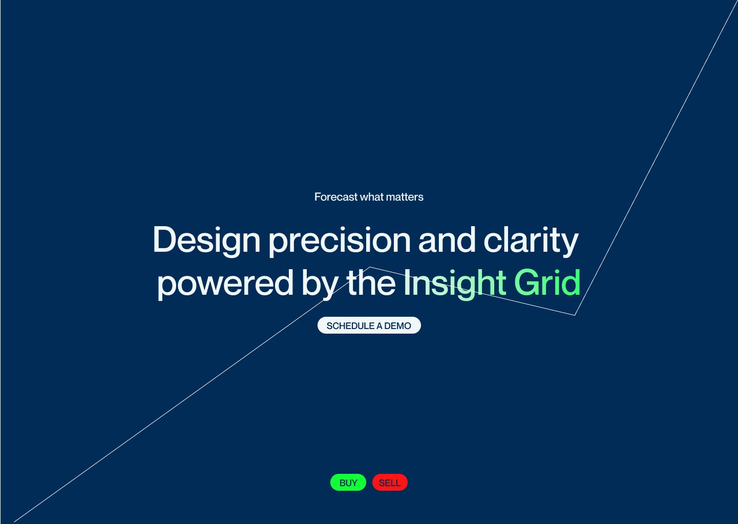
The Insight Grid · where the Predictive Engine surfaces its output
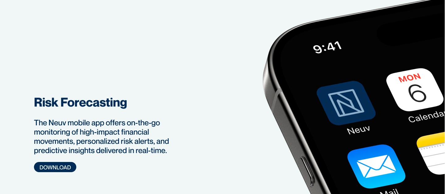
Risk Forecasting · the Decision Layer, on device
Outcome
What I made
- ·The identity and custom mark
- ·A type system, layout logic, icon language and colour architecture
- ·A UI hierarchy and a screen set from onboarding to dashboard
What changed
- ·Nothing outside my portfolio, because this is a concept. No one has tested it with users.
Reflection
Neuv is my sandbox: no client, no constraints, just the question of how clear a financial product can feel. It shows I can carry one idea from naming to dashboard as a single system. It also shows the limit of working alone. No user has tested it, and fintech style moves fast, so a rebuild would start with people, not screens.